
Here I explain the thought process and technicalities behind this assignment.
«━━━━━♥♠♣♦━━━━━»
My overall reflection of this assignment is that I learnt a lot about HTML and CSS by simply making it.
At first, even while doing the lessons, I "half understood" it, and I was not looking forward to this assignment.
However, by the time I actually started it, I was really enjoying how the code turns into visual elements, and does whatever you tell it to... well, most of the time.
I think, at first it's overwhelming, and if you stare at your site too much it drives you crazy. But, being able to turn all those HTML characters into something readable and visually pleasing is nice.
Overall, I believe I used HTML and CSS elements cohesively, in order to make a series of interesting webpages.
«━━━━━♥♠♣♦━━━━━»
| Technical Aspect | Example | Why I used it |
|---|---|---|
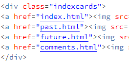
| Div classes on each page. |
| I used div classes to separate my "tabs", text, images and body on each page. This made it easier to organise my css code and be able to target certain chunks of the webpage, such as just body paragaphs. |
| CSS ids on each page. |
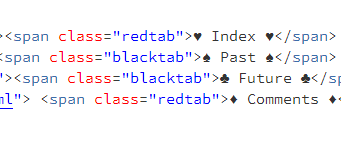
| I had to seperate my tabs into red and black, so it would fit with my card theme. If i kept them all under the same css id then the colour would be the same. It was much easier to separate colours and elements. |
| Span class. |
| Span classes were very helpful. They are similar to div classes, but I'm able to select smaller portions to style on my CSS sheet. By using span class, I was able to separate the colours and links on the "tabs" at the top. |
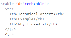
| HTML Table with CSS styling on this page. |
| This table is written with HTML, but as per the assignment rules, the styling is done in CSS. I used tables here as they would appropriately organise such information. |
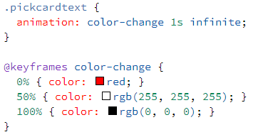
| @keyframes usage - colour changing "pick a card" text. |
| This was fun to play around with. I used it for aesthetic purposes. I think the colour changing text emphasises the overall theme of my site. |
«━━━━━♥♠♣♦━━━━━»
I think my overall design is interesting. I like the black background, and the contrasting white text for readability.
There are enough pictures to keep it interesting, but not so many that it's overwhelming. I like that the cards theme is incorporated in my word choice "pick a card..." and also the colours of the webpage.
I think viewers might be suprised by the dark background, but I think a lot of people would appreciate that my website is permanently in dark mode :D.
Which, is the reason why I picked a colour palette that is easy on the eyes, consisting of black, white and red (like a deck of cards).
On that note, I think the "deck of cards" theme was able to consistently bind together my webpages. They all carry the theme, which creates some neatness.
Navigation is fairly simple, there is a white bar at the top containing link to each webpage. There is also a big heading at the top showing the current webpage.
Hence, it has been made very clear to me that it's not what you write, but how you write it.
I would say that my design is fairly simple, but there are bits of it that make it stand out.
«━━━━━♥♠♣♦━━━━━»
The website could be a lot more accessible. At best, I have used alternative text for all images. Moreover, the HTML alone would portray the information without the CSS styling.
My site does not rely on java either. Therefore, if a viewer could not see the styling or images, the text would be understandable and functional (e.g. hyperlinks in the "index" cards).
I think my limited use of colour, and sticking to a certain colour palette, would keep the site from being overstimulating.
However, as much as I like the colour changing text, it could possibly be a problem for someone with flashing light sensitivity or sensory issues.
Despite the fact that a viewer doesn't need to type for navigation, I think it may be difficult for someone with motor skills to navigate the tabs at the top.
Moreover, the font is readable. I incorportated San Seriff fonts, such as Helvetica and Arial. These fonts make it easier for people with dyslexia.
However, the site unfortunately makes a sound effort to those with motor skill issues, as navigation relies on clicking through tabs. Overall my site is functional and relatively accessible.
«━━━━━♥♠♣♦━━━━━»